How Beauty Product Packaging Influences Your Emotions
Why Your Brain Loves Pretty Boxes
Your brain processes the look of a beautiful box in less than 200 milliseconds. This is faster than the blink of an eye. When you see attractive beauty product packaging, your brain’s reward center lights up immediately. This area is called the ventral striatum. It is the same part of the brain that reacts to a delicious meal or a winning lottery ticket. You feel a small spark of joy before you even know what is inside the container.
This reaction happens because our ancestors needed to find fresh food and clean water. Nature uses bright colors and smooth shapes to show that something is good. Modern designers use these same tricks to grab your attention. They choose specific colors to change your mood. For example:
- Blue colors often make people feel calm and safe.
- Gold accents suggest that the product is high quality.
- Soft pinks can trigger feelings of comfort and care.
- Bright red can make your heart beat slightly faster.
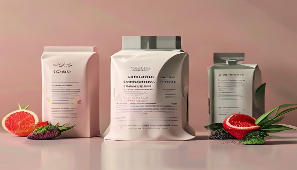
Texture also plays a big role in how we feel. A heavy glass jar feels more valuable than a thin plastic one. Your brain links weight with power and trust. When beauty product packaging feels sturdy, you believe the cream inside will work better. This is a mental shortcut. Your eyes and hands tell your brain a story about the brand. You are not just buying a lotion; you are buying a feeling of luxury.
Symmetry is another tool that designers use. Humans naturally love balanced shapes. A symmetrical logo or bottle looks healthy and right to our eyes. This sense of order reduces stress. When a box looks neat, we assume our life will become more organized if we buy it. We seek out these moments of beauty to balance a messy world. This deep connection explains why we keep pretty boxes on our dressers long after they are empty. These objects act as small anchors for our emotions throughout the day. This instant bond happens long before you check the price tag or read the ingredients.
The First Three Seconds at the Store Shelf
Your brain decides to buy or ignore an item on a store shelf in less than three seconds. In this tiny window of time, your conscious
The Secret Power of Colors in Design
Why Gold and Black Create a Luxury Feeling
Colors change how you feel about a product before you read a single word. Black and gold are the most common colors used to show high status. Black is a strong color
Using Soft Pastels to Build Brand Trust
Soft colors like pale pink and light blue lower a person’s heart rate. These colors are called pastels. They have a lot of white mixed into them. This makes them look gentle and quiet. In the world of design, we use these shades to make people feel safe. A bright red sign shouts at you to look now. A soft mint green sign invites you to come closer.
Trust is hard to build but easy to lose. Brands use pastels to show they are honest. They want you to feel that they have nothing to hide. Think about beauty product packaging for a moment. When you see a light lavender box, you expect a gentle experience. You do not expect harsh chemicals or strong smells. The color tells your brain that the product is kind to your skin.
Scientific studies show that people view pale colors as more sincere. Dark colors can feel mysterious or heavy. Pastels feel light and open. This is why many products for children use these tones. Parents want to feel that a brand is safe. Designers call this effect visual quiet. It removes the stress of making a choice.
Pastels work well for these reasons: – They reduce stress levels in the human brain. – They suggest the product is natural and healthy. – They make a brand seem more friendly and less corporate. – They help the eyes rest when looking at a busy shelf.
When a brand uses soft colors, it stops trying to sell. It starts trying to help. This shift in tone changes how we think. We stop being defensive and start being curious. A soft color palette is a silent promise of safety and care. These colors turn a simple item into a trusted part of a daily routine.
Why the Weight of a Bottle Matters
How Heavy Materials Signal High Quality
Your brain links weight to value before you even open a lid. This is a mental shortcut called haptic perception. When you hold a heavy glass jar, your nerves send a clear signal to your brain. This signal says the item inside
The Sound of a Click and Product Value
Sound reaches the emotional center of your brain before you even realize it. When you pick up a bottle, you do more than just look at it. You listen to it. High-end beauty product packaging often uses sound to tell a story of wealth. A cheap plastic cap makes a thin, scratchy noise. This sound tells your brain that the item is flimsy. In contrast, a heavy magnetic cap closes with a deep, solid click. This specific sound signals that the product is expensive and well-made.
Engineers spend hundreds of hours perfecting these tiny noises. They want the sound to feel intentional. A hollow sound suggests empty space or thin materials. A dense sound suggests strength and value. This is why many brands use magnets in their lids. The magnet pulls the cap into place with a satisfying snap. This snap gives the user a sense of closure and security. It feels like a door on a luxury car closing.
When a cap clicks, it releases a small puff of air.
How Fonts Tell a Story Without Words
Choosing Clean Lines for a Modern Look
Modern fonts use straight lines and sharp corners to signal progress. These fonts are often called sans-serif. This name means the letters do not have the small “feet” or hooks at the ends of their strokes. When you see these clean lines, your brain thinks about the future. It associates simplicity with high technology and efficiency. Thin letters feel light and airy. They suggest a product is not heavy or crowded with extra ingredients. This look is common in beauty product packaging today. Brands want to show that their science is new and advanced.
A clean font removes visual noise from the label. Our eyes move faster across smooth and simple shapes. This speed makes a brand feel fast and energetic. If a company wants to look like a new startup, they choose thin, geometric letters. These shapes are often based on perfect circles and squares. This math-based design feels honest and clear. It tells the customer that the brand has nothing to hide.
Clean lines offer several benefits for a brand: – They look sharp and clear on small phone screens. – They feel more personal and less bossy than thick letters. – They suggest the product is easy for anyone to use. – They make the brand feel younger and more relevant.
Using lots of empty space around thin letters adds a feeling of luxury. It shows the brand is confident enough to be quiet. In beauty product packaging, this often means the box is mostly white with just a few sharp words. This look tells you the product is pure. It suggests the ingredients are high-quality and tested in a modern lab. Simple fonts do not try too hard to grab your attention. Instead, they invite you to look closer at the details. This quiet style builds a sense of mystery and modern style. It prepares the reader to see how different shapes can also create a feeling of history.
Why Traditional Fonts Make Brands Look Reliable
Traditional fonts use small decorative lines called serifs at the ends of letter strokes. These tiny feet help the eyes follow a line of text more easily. This style comes from ancient stone carvings and early printing presses. We have seen
The Role of Texture in Sensory Branding
Why Smooth Surfaces Feel More Expensive
Your fingertips contain thousands of tiny nerves that send signals to your brain instantly. When you touch a surface that is perfectly smooth, your brain registers this as a sign of high quality. This reaction happens because smooth materials are difficult and expensive to produce. In a factory, it takes many extra steps to remove every bump, scratch, or flaw from a material. A sleek glass jar or a polished metal lid tells the buyer that the maker spent time and money on every detail.
In the world of beauty product packaging, texture acts as a silent salesman. A smooth surface often feels cool to the touch and has a certain weight. People naturally link these physical traits to wealth and professional care. This process is called haptic transfer. It means your brain takes the physical feeling of the container and applies it to the substance inside. If a bottle feels like polished silk, you expect the lotion inside to make your skin feel just as soft.
Rough textures usually remind people of raw materials found in nature, such as wood or sand. While nature is pleasant, it is also common and free. Smoothness feels refined and rare. Research shows that people are often willing to pay a higher price for items that feel fluid and consistent. – Smooth surfaces reduce friction against the skin. – Low friction creates a sense of ease and calm. – A lack of bumps suggests the product is pure and safe. – High-shine finishes reflect light, which draws the eye and the hand.
This feeling of luxury is not only about the price of the item. It is about how the object makes the user feel about themselves. Holding a smooth, heavy object can actually lower your stress levels for a few seconds. It feels stable and reliable in your hand. Designers use these textures to make you feel like you are treating yourself to something elite. Every time you reach for that smooth bottle, your brain rewards you with a small sense of success. This physical connection creates a strong bond between the shopper and the brand. It turns a simple daily routine into a premium experience.
Using Paper Quality to Show Eco-Friendly Values
Rough paper tells your brain that a product is natural before you read a single word. This happens because our hands sense the raw fibers of the material. Smooth, shiny paper often looks like plastic or heavy chemicals. In contrast, paper with a grainy feel reminds people of trees and the earth. Many companies use this trick to show they care about the planet.
When you touch beauty product packaging made from recycled paper, your mind makes a quick choice. It decides the brand is honest and kind to nature. This choice happens in the somatosensory cortex. This part of the brain handles touch. It links the feeling of grit or uneven edges to the idea of organic life.
Why does this work so well for a brand? – Recycled paper often has tiny brown or grey flecks. – The surface feels warm rather than cold and clinical. – It lacks the chemical smell of heavy coatings. – It suggests the brand did not use extra bleach or dyes.
Using these materials creates a sense of trust. A customer sees a rough box and thinks the ingredients inside are safe. They do not need to see a green leaf logo to know the goal. The weight and grip of the paper do the talking. This is how brands build a bond with people who want to save the earth. They use the physical world to prove their values.
Even the sound of the paper matters. Rough paper makes a low, soft sound when you rub it. Glossy paper makes a high, sharp sound. The low sound feels more grounded and real. People who buy natural goods look for these small signs. They want to feel the earth in their hands. By choosing raw textures, a brand proves it is part of the solution. It turns a simple box into a message about the future. This physical proof is often more powerful than any marketing claim. It makes the brand’s promise feel solid and true.
Winning the Customer at the Store Shelf
How Visual Hierarchy Leads Your Eyes
Your brain decides what is important in less than one second when you look at a store shelf. This choice happens before you even think about the product. Design acts like a map for your eyes. It tells you where to look first, second, and last. Most people scan a shelf from the top left to the bottom right. This is a natural habit. Designers use this habit to win your attention. They want to make sure you see the most important part of the beauty product packaging immediately. This organized path is called a visual hierarchy.
Size is the easiest way to lead the eye. A large word will always grab your focus before a small one. If a box has a giant word like “GLOW” written on it, that is what you see first. Color works in a similar way. A bright red bottle stands out against a row of white ones. This is not an accident. It is a calculated move to break your focus. Contrast helps the eye find a starting point. Without it, the store shelf would look like a blurry wall of noise.
Once the eye lands on an item, it follows a specific path: – The brand name or logo usually comes first to build trust. – The main benefit or product type comes second to answer your needs. – Small details like weight or ingredients come last for final proof.
This order helps you process information quickly. If the design is messy, your brain gets tired. You will likely look away and choose a different item. Good design makes the choice feel easy and fast. It removes the work of thinking.
White space is also a powerful tool in this process. This is the empty area around a logo or text. It acts like a spotlight. When a word has lots of empty space around it, it looks more important. It feels clean and high-end. In beauty product packaging, white space suggests that the product is pure and simple. It gives your eyes a place to rest. This rest makes the main message even clearer to the shopper.
Visual hierarchy turns a busy shelf into a clear story. It guides your gaze through a series of steps without you knowing it. You see the brand, then the promise, and then the details. This silent guide helps you make a choice without feeling overwhelmed. Once your eyes find the right spot, your body is ready to react. This visual lead is what makes you reach out to touch the box.
Creating a Connection Before the First Touch
The human brain processes images 60,000 times faster than text. This speed means your feelings about a product start long
The Future of High-End Beauty Product Packaging
Why New Designs Focus on the Earth and Luxury
High-end brands used to think that heavy plastic meant high quality. Now, the world of beauty product packaging is changing fast. People want luxury items that do not harm
How Smart Design Will Change Your Shopping Habits
Modern beauty product packaging now uses tiny computer chips to talk to your phone. These chips are called NFC tags. You can tap your phone against a luxury cream jar. Instantly